Pick Colors#
Convey meaning through color. By default, panel-material-ui provides access to the Material Design color system, allowing you to choose from a broad set of hues and shade combinations.
The Material Design color system can be used to create a cohesive color theme that matches your brand or style.
Picking colors#
Official color tool#
The Material Design team provides a powerful palette configuration tool at material.io/resources/color/. It helps you:
Select color pairs and gauge their accessibility levels.
Generate palette suggestions you can directly feed into
panel-material-uifor yourtheme_config.
Using the palette in panel-material-ui#
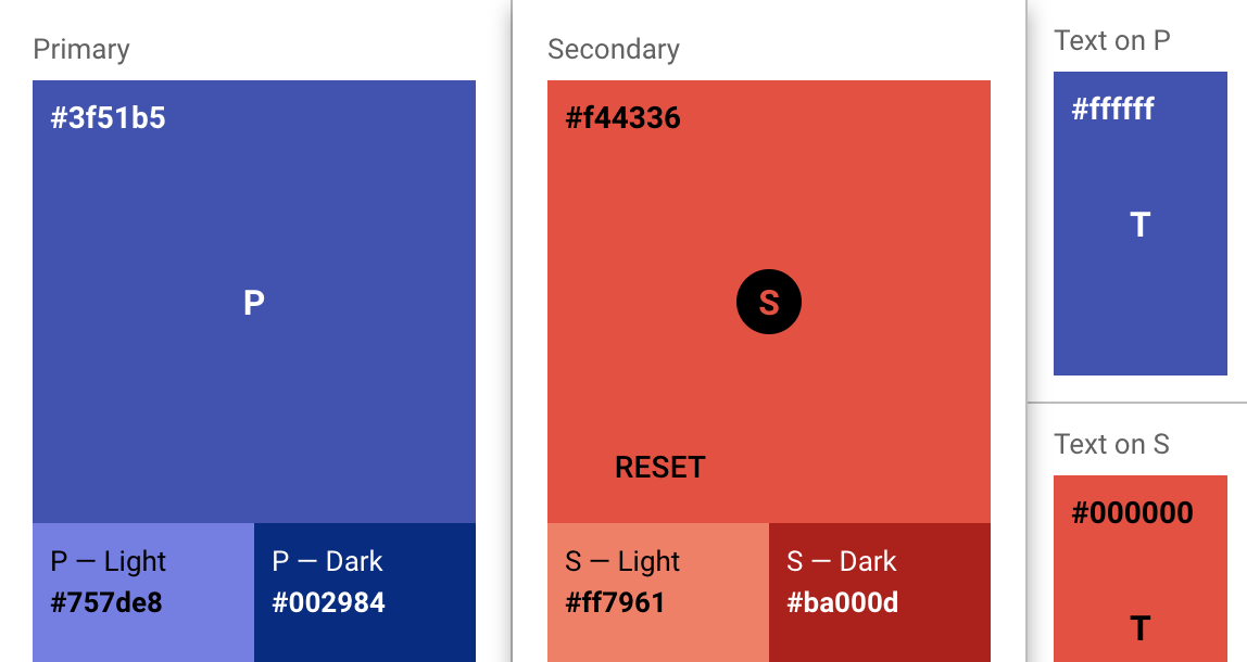
In panel-material-ui, you specify colors in a theme_config dictionary. Below is a simple example of customizing both the primary and secondary colors in your UI:
from panel_material_ui import Button, Row

my_theme = {
    "palette": {
        "primary": {
            "light": "#757ce8",
            "main": "#3f50b5",
            "dark": "#002884",
            "contrastText": "#fff"
        },
        "secondary": {
            "light": "#ff7961",
            "main": "#f44336",
            "dark": "#ba000d",
            "contrastText": "#000"
        }
    }
}

Row(
    Button(label="Primary Button", theme_config=my_theme, button_type="primary"),
    Button(label="Secondary Button", theme_config=my_theme, button_type="secondary"),
).servable()
If you only provide main,
panel-material-uimay calculate light, dark, and contrastText automatically (note this does not work for the default, dark, and light palettes).Defining all four explicitly lets you fine-tune exactly how your components appear.
Playground#
The material.io/design/color site includes interactive sliders and hex fields for picking primary and secondary colors. Once you find colors you like:
Copy the resulting hex codes.
Plug them into your
theme_config["palette"]for primary and secondary.Any component that uses the “primary” or “secondary” theme keys will reflect these choices.
For example, if you settle on purple for primary and a certain red for secondary, do:
from panel_material_ui import Button, Row

my_theme = {
    "palette": {
        "primary": {
            "main": "#9c27b0"  # Purple 500
        },
        "secondary": {
            "main": "#f44336"  # Red 500
        }
    }
}

Row(
    Button(label="Purple", theme_config=my_theme, button_type="primary"),
    Button(label="Red", theme_config=my_theme, button_type="secondary"),
).servable()
Tools by the community#
mui-theme-creator: A web UI for picking colors, showing how components appear under various palettes.
Material palette generator: Google’s official tool for generating harmonious palettes.
Accessibility#
According to WCAG 2.1 Rule 1.4.3, text should have at least a 4.5:1 contrast ratio. Material UI’s default palette enforces a 3:1 contrast. If you need higher contrast (AA-level compliance), you can override the default color contrast behavior in your theme:
my_theme = {
    "palette": {
        "primary": {"main": "#3f50b5"},
        "contrastThreshold": 4.5,  # Force higher contrast across the board
    }
}
If you’d like more details, refer to the Material UI Palette Accessibility docs (the same principles apply in panel-material-ui).


